Turning Maritime Heritage Into an Award-Winning Shelf Story
✎﹏﹏﹏﹏
Visual hierarchy and local narrative come together to providing the brand team with a standout project to showcase.
The modern beverage aisle presents an immense challenge for brand managers and category leads striving to maintain product visibility. When retail shelves are densely packed with competing visual styles, standard design approaches often fail to command attention.
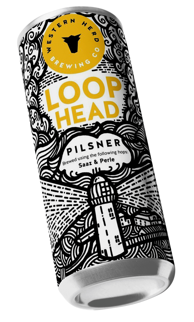
For the team behind Loop Head Pilsner—a crisp, coastal brew inspired by the iconic lighthouse on County Clare’s dramatic western edge—the objective went beyond creating a standard product label. The priority was establishing a commanding visual footprint capable of standing out in busy off-trade environments without sacrificing long-term brand equity.
“When commercial environments demand instant differentiation, cautious design choices risk blending into the background. A strong, purposeful identity gives internal brand custodians the confidence to champion bold work—and take real pride in accepting industry recognition when the results speak for themselves”.
The Strategic Direction: Translating Regional Identity into Commercial Assets
Rather than relying on generic coastal tropes, Top Shelf Studio structured the brand narrative around a distinct local voice that anchors the product immediately in consumer perception:
“The Loop Head lighthouse has been guiding merchant ships along the west coast for a long time with vital consignments safely reaching the beer fans of Clare via this old maritime route. These days, beer is shipped out of the county too. Like this crisp, dry Pilsner you’re holding...”
For the internal brand team, this narrative framework provided a clear commercial advantage. It offered a compelling, authentic story that resonated with buyers and gave leadership a polished, premium positioning that scales naturally across retail channels.
The Execution: Precision Design & Technical Reliability
Translating this strategic intent into a finished product required rigorous attention to both aesthetic execution and manufacturing realities:
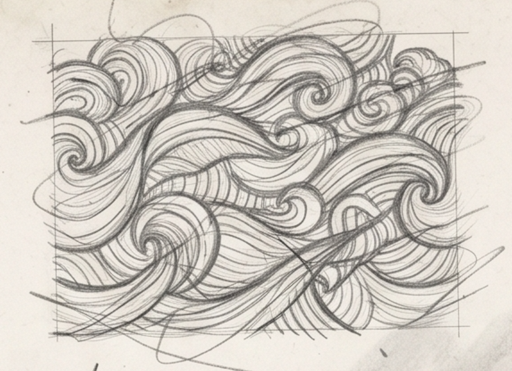
Distinctive Line Architecture: We developed clean, striking line art that establishes immediate visual clarity, ensuring the product commands attention before the consumer even handles the can.
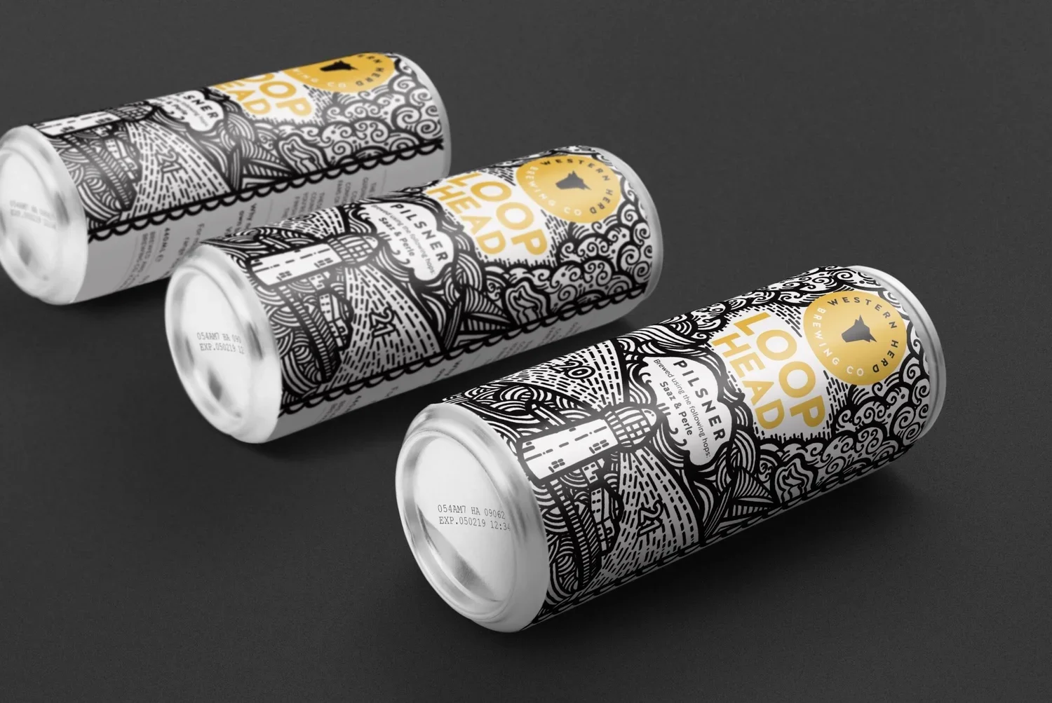
Shelf-Ready Performance: Designed as a definitive single-SKU asset, the visual layout holds its structural integrity under challenging supermarket lighting and refrigerated display conditions.
Production-Ready Engineering: Built from the ground up to meet the technical demands of high-speed print runs, ensuring flawless tactile quality from the production line to the awards ceremony.

The Commercial & Professional Outcome
- Overall Winner for Packaging Design, Shark Awards
- Immediate visual cut-through in highly competitive retail sectors.
- Delivered a definitive portfolio piece that validated commercial risk-taking, secured industry recognition, and provided well-earned visibility for the internal brand team.
If you want to talk to us about introducing memorable, grabbable designs to your product portfolio then reach out ➪ today