Turning a Historical Grudge Into an Award Winning Craft Beer
✎﹏﹏﹏﹏
A study of narrative impact, distinctive typography, and packaging that commands the craft fridge while giving brand custodians a project they can proudly put on stage
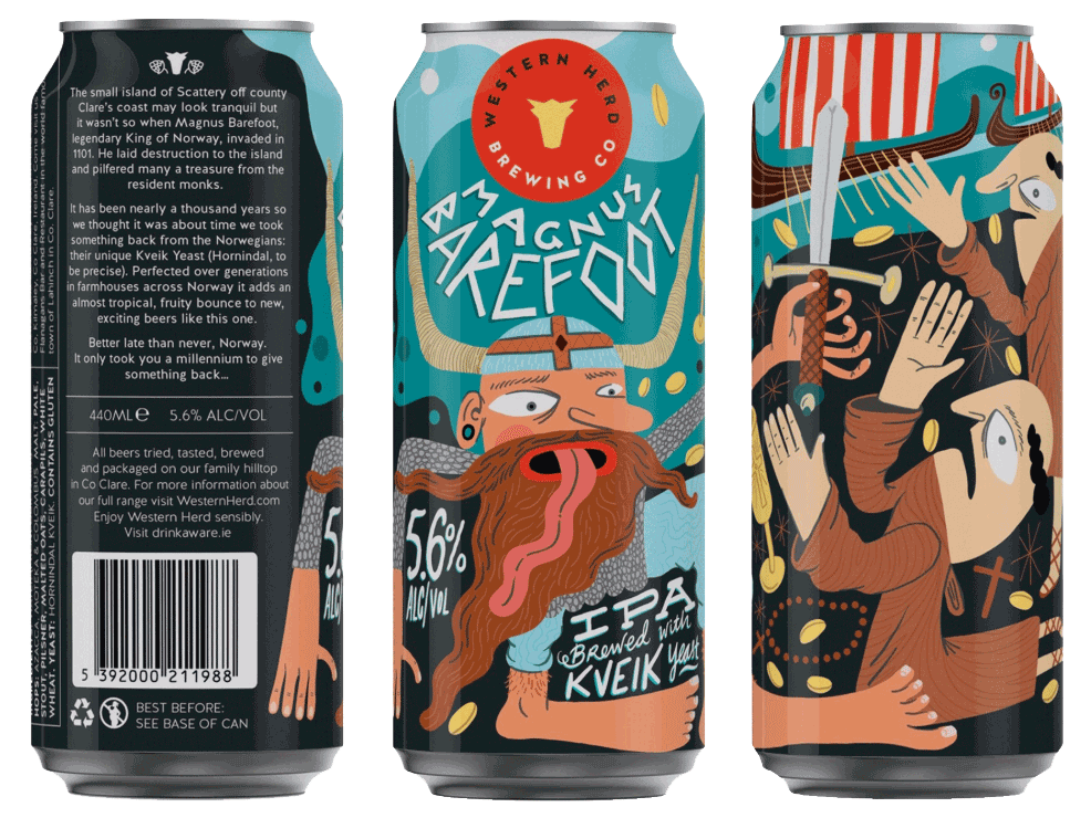
When the brief came down for Magnus Barefoot—a craft IPA brewed with traditional Norwegian Hornindal Kveik yeast to commemorate the 1101 Viking invasion of Scattery Island off Ireland’s west coast—the goal wasn't just to design a clean label. The challenge was crafting a standalone commercial narrative sharp enough to cut through retail clutter and bold enough to stand out in a crowded market.
"When retail buyers are drowning in generic typography and interchangeable illustrations, playing it safe is a commercial liability. Distinctive design gives the brand team a project they can stand behind with absolute confidence—and take real pride in showcasing."
〰
〰
The Strategic Mandate: Weaponising Heritage for Retail Dominance
Rather than treating the historical footnote of Magnus Barefoot as dusty heritage storytelling, Top Shelf Studio engineered the narrative into a sharp, witty consumer hook that drives immediate dwell-time at shelf:
“It has been nearly a thousand years, so we thought it was about time we took something back from the Norwegians: their unique Kveik Yeast... Better late than never, Norway.”
For the internal brand team, this provided a clear commercial differentiator and a strong, engaging narrative to present to senior leadership: a premium, culturally rich positioning that balances historical intrigue with modern craft attitude without alienating mainstream buyers.
The Solution: Architectural Execution & Shelf-Shouting Mechanics
Top Shelf Studio translated this narrative tension into a rigorous, production-ready packaging design:
Typography & Tone: We bypassed standard craft beer tropes in favor of bold, proprietary typographic hierarchy and tone-of-voice copywriting printed directly on the pack. This ensures the consumer interacts with the brand story before they even pick up the bottle.
Standalone Shelf Presence: Engineered as a definitive single-SKU hero product, the design commands immediate visual gravity under harsh supermarket fluorescent lighting and refrigerated retail condensation conditions.
Production Integrity: Built from the ground up for high-speed print runs, ensuring the tactile finish looks as pristine in commercial distribution as it does on stage at an industry awards ceremony.

The Payoff: Commercial Velocity & Industry Recognition
- Overall Winner: Shark Awards, Packaging Design
- Instant retail cut-through in crowded off-trade accounts.
- Delivered a benchmark-winning portfolio piece that proved high-impact creative thinking drives commercial success, industry-wide recognition, and well-earned visibility for the brand team.
If you want to talk to us about introducing memorable, grabbable designs to your product portfolio then reach out ➪ today